Foreword
Absolutely positioned elements can be quite useful, but what if you have something centered or off to one side and you need to just nudge an absolutely positioned element. The following will show you a handy technique for moving absolute elements relative to the elements around it using nothing but CSS.
Getting Started
First let’s put together a scenario. Let’s say you have an XHTML document like the following:
1 2 3 4 5 6 7 8 9 10 11 12 13 14 15 16 17 | <!DOCTYPE html PUBLIC "-//W3C//DTD XHTML 1.0 Transitional//EN" "http://www.w3.org/TR/xhtml1/DTD/xhtml1-transitional.dtd"><html> <head> </head> <body> <div class="article"> <label class="title">A Test Article</label> <p>Lorem ipsum dolor sit amet, consectetur adipiscing elit. In nec libero ac sapien dapibus dapibus. Sed a enim risus, non hendrerit nunc.Sed non scelerisque ipsum. Nulla congue accumsan quam id pharetra. Nunc dolor purus, aliquam eu sodales id, pulvinar a sem. Nunc vel loremut ligula ultricies sollicitudin sit amet quis justo. Morbi tincidunt porta ipsum, at viverra tellus vehicula nec. Ut arcu nunc, ultricesnec pellentesque dignissim, molestie vitae lorem. Sed id ultricies leo. Nam porttitor justo non arcu eleifend imperdiet.</p> </div> </body></html> |
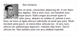
To make things a bit more complex for this example, let’s say the article was centered and you wanted to have the avatar image left positioned outside of the article container. Using relative positioning this is quite easy, but we don’t want a blank area where the avatar image. So to solve this we need to position the element absolutely. Let’s add the following CSS declarations:
1 2 3 4 5 6 7 8 9 10 11 12 13 14 15 16 17 18 19 20 21 22 | .article { font: 13px sans-serif, tahoma, helvetica, arial; width: 400px; margin: 0px auto; border: solid 1px #efefef; padding: 10px;}.article label.title { font-weight: bold;}.article cite.author { font-style: italic; margin-left: 20px;}.article img.avatar { position: absolute; padding: 3px; border: solid 1px #efefef;} |
Now when we view the page, the problem becomes very self evident.
Solution
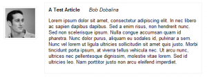
To solve the problem, we need to use both absolute positioning so the element does not take up visual space in the DOM, and we need to somehow position the element using relative coordinates. We can do this by using positive and negative margins very much the same way you would use top or left when the element is positioned relatively. Consider the following:
margin-left: -120px;
Let’s add this declaration to our avatar image in CSS and see what happens.
1 2 3 4 5 6 7 8 9 10 11 12 13 14 15 16 17 18 19 20 21 22 23 | .article {font: 13px sans-serif, tahoma, helvetica, arial;width: 400px;margin: 0px auto;border: solid 1px #efefef;padding: 10px;}.article label.title {font-weight: bold;}.article cite.author {font-style: italic;margin-left: 20px;}.article img.avatar {position: absolute;padding: 3px;border: solid 1px #efefef;margin-left: 120px;} |
Perfect! The avatar image is outside the visible article container which is bordered, the article is centered using margin auto. We’ve in essence, relatively positioned an absolute element.


0 Comments